How often have you actually looked at the logo on the front of your car? You know who makes it and you know what their logo looks like but when was the last time you had a proper look at it? Have you ever wondered where it might have come from? Probably never, I know I never had before I started delving into some of the history behind them and it is quite honestly fascinating! For example:
BMW
Let’s start with one almost everyone will recognise and also the company that makes our most popular car, the BMW 3 series. BMW is a Bavarian company and the logo very simply reflects the colours of the Bavarian flag. BMW used to be an aviation company and there is a very popular myth in circulation that the logo is based on what the pilots used to see from the cockpit. The alternating segments of white from the propeller and blue of the sky supposedly created an image like that of the BMW logo. This has long since been disproved and officially debunked by BMW themselves.
As you can see below, the logo has not changed much over the years although it does now look more up to date and modern. That being said, I quite like the innocence of the kind of handwritten looking lettering on the old logo. Don’t be fooled by many of the other evolution of BMW logo images that include a sixth logo in the 70s and 80s that is particularly abstract. This is the BMW racing logo and was not on the production cars. Others have added this so they can have three logos on top and three on the bottom. Come on guys!
Citroen
This is one of my absolute favourites, mainly because of the historic story and simplicity of the inspiration behind the famous logo.
Andre Citroen, founder of Citroen oddly enough, was really in to wooden gears with spiral teeth, like, really in to them. On his travels in Poland he came across a very innovative design for chevron shaped gear teeth (see where this is going yet?), that was being used on wooden gears for milling. He bought the patent to use it in steel gears and started production. These gears were really popular, in fact they were even used on the Titanic!
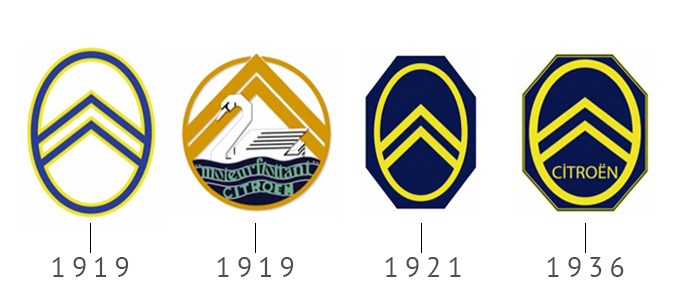
The original logo is very simply a representation of two of these gear teeth inter-meshing. I say this is what the original logo represents, the modern one still represents the same thing, they are just more stylised. The actual design of the logo has barely changed, something I really appreciate. If you have a good, solid design then you should stick to it! There have of course been some embellishments on the design, such as the 1919 logo and the 1936 logo but the basis has remained the same since it’s conception.
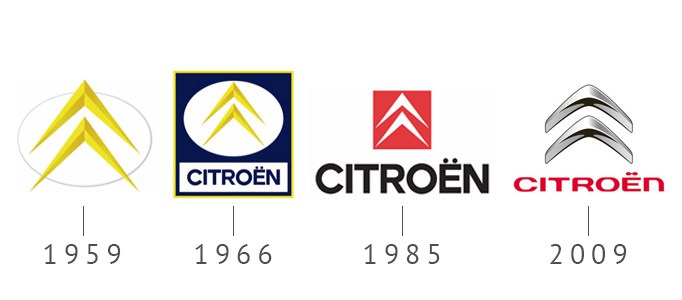
The chevrons were made 3D, following the trend of other automakers and in 2004 they softened the edges of the design. The most recent incarnation of the logo certainly looks more modern. Although the history and meaning is still there, they look more fluid and less aggressive which I think is a good thing.
VW
Next up it’s VW and this one is a good ‘un, not because of the design elements but because of the history behind them. Many of you will never have seen these older iterations of the VW logo, probably because VW’s PR department has done a pretty good job of burying them and it’s obvious to see why.
Volkswagen’s history is linked directly with that of Adolf Hitler and while the company clearly has nothing to do with him or his way of thinking anymore, the influence is clear to see in their old logos.
Before the Second World War the German car market was in serious trouble, after German defeat in WW1 and the sanctions imposed on the German economy as a result, people simply could not afford to buy cars. Germany needed a cheap car and before his rise to power, Hitler had proposed the idea of a economically viable, cheap car for the masses. In fact Volkswagen literally means ‘People’s Car’.
Ferdinand Porsche met with Adolf Hitler, specifications for the car exchanged hands and production started, simple as that. Hitler even built a Volkswagen factory, backed with state money, to produce this new car. Unfortunately it turned out that Hitler had his own secret agenda (surprise, surprise), having no intention for the car to actually be for the people. Instead he had always intended it to become a military vehicle, to seat three men and machine gun, this is what the factory ended up producing.
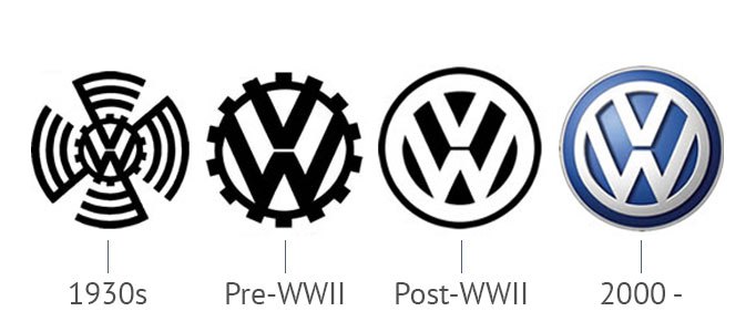
You can see the Nazi Swastika was clearly an influence on the 1939 VW logo and even before WWII, the logo doesn’t exactly look friendly. Resembling a cog or, depending on how you look at it, what could easily be a wheel that drives the tracks on tanks. That’s what it says to me anyway, it certainly doesn’t invoke any pleasant feelings for the company.
The company was taken over by the British but none of the big car manufacturers at the time wanted to take on a company that had links with Nazi Germany so it was handed back to the German government. I wonder how bad they are kicking themselves right now? The now Nazi influence free VW obviously removed anything sinister from the Logo after WWII and that’s where we get the logo we know today. A further update in the year 2000 added some well needed colour to the design and it has stayed like that ever since.
Mitsubishi
The story behind Mitsubishi’s Logo is another great historical tale and the logo directly reflects the story which is really cool.
The Mitsubishi brand was created by the Iwasaki family, specifically by Yataro Iwasaki who was born back in 1885, that’s how old the Mitsubishi brand is! The Iwasaki family previously had Samurai status in (awesome) Japan but Yataro’s great grandfather had to sell this status to pay off debts. That’s not particularly relevant, I just thought it was really cool, although it does come up again later.
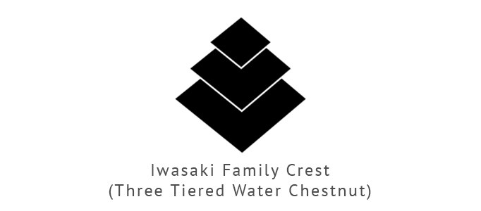
The Iwasaki family crest is a ‘three tiered water chestnut’ although commonly referred to as three diamonds. The below image is the Iwasaki family crest, remember that, it’s important.
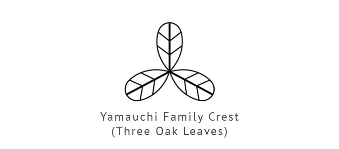
Yataro was sent to prison after accusing a magistrate of being corrupt when his father was injured in a feud with a fellow villager and refused to hear his case. After he returned he became a clerk for the Tosa government, who’s leaders were the Yamanouchi family, who’s crest is displayed below, called the ‘three oak leaves”. This is also important, remember it.
Yataro was eventually promoted to the top dog at the Tosa clan’s trading office. After the Meiji Restoration, which essentially saw the disbandment of the military dictatorship and clan system, the Tosa clan suffered heavily. Yataro decided to lease the trading rights for the Tosa Clan’s Tsukomo Trade Company and renamed it as Mitsubishi.
The name Mitsubishi is a combination of the words Mitsu (meaning ‘three’) and Bishi (meaning ‘water chestnut’). Can you see what’s going to happen here? Yataro combined crests of his own clan, the ‘water chestnut’ or ‘three diamonds’ with the crest of the Yamanouchi familiy’s, the ‘three oak leaves’ to create the Mitsubishi logo. He then drew the name Mitsubishi from these two combined elements. It’s really quite elegant.
Audi
The Audi story is a very long but quite fascinating one and you can’t tell the story of their Logo without delving into their history. We would be here all day if I tried to explain the whole Audi story in detail but I’ll do my best to provide everything relating to the Logo and drop in some interesting facts when I can. Brace yourself for this image, it’s a biggun.
It all starts back with a man called August Horch, a German Engineer, who was unfortunately forced out of his own company and then sued by his old company when he tried to continue using his own second name for business. He had to find a new name for his company which has its own origin story. The idea came from the son of Horch’s business partner, who was supposedly studying Latin during a business meeting between his father and August Horch. He came up with the idea ‘Audi’ because it is a Latin translation of ‘listen’ which is ‘Horch’ in German. It’s a clever little dig at his old company that ousted him.
Anyway, so now we have Horch and Audi, we also have two more German automakers by the name of DKW and Wanderer. These were all separate entities until 1932 when they merged into the ‘Autounion’. The Autounion is where we get the origins of the current Audi Logo from, the four interlinked rings signifying four linked companies. The company ran as Autounion for a good while, then in the 50s, the Autounion merged with NSU, who were the world’s largest producers of motorcycles at the time. The newly merged companies was known as Audi NSU and that is where we get the logo in 1969.
Audi was originally only used for racing cars but essentially became it’s own brand within the company. The Autounion and NSU ran it’s course and both effectively died as individual brands, leaving Audi as the torch holder. They dropped everything except Audi from the logo, which is where we get the oval logo. Interestingly they obviously saw fit to rummage around in the filing cabinets and start using what was essentially a modern take on the old Autounion logo which is when the company returned to it’s four rings logo which as you all know, they still use today.
Well there we go then, five very famous companies with very famous logos and now you know a little bit more about them. I found this whole thing so interesting that I’ll be attempting to cover all of the big car companies in the near future. Check back soon!
In the meantime why not check out James’s awesome post about the cars in Mad Max: Fury Road?
Feeling arty after all those logos? Take a look at the work of PopbangColour in our profile on him.


 Facebook
 Twitter
 Instagram
 LinkedIn
 Youtube